This lab does research that actually matters, but you'd never know it online: no real identity, an outdated site, nothing that made people trust what they were looking at.
RTS Lab
We're Team IGNIS, and we built RTS Lab's entire brand and digital presence from scratch: the identity, the system behind it, and a working prototype.
We built them a brand from the ground up (guidelines, a UI system, a working prototype) so their work finally looks like what it is.
RTS Lab
Brand Identity & UX/UI · Team IGNIS
Idil Kale · Khadija Osman · Jasvitha Madine · Alex Yusupov · Joshua Stubbs
Arizona State University · 2025–2026
The Challenge
We partnered with the Responsible Technology & Society Lab, a research group studying how AI, automation, and digital systems are reshaping society. Their work was solid, but their website didn't show it. There was no real visual identity, and the site itself looked like it hadn't changed in years. People had a hard time finding them, and when they did, nothing on the page told them to take the research seriously.
What RTS Lab Asked For
The client didn't want a logo refresh. They wanted a full brand and digital experience, one that could speak to researchers, students, industry partners, and policymakers all at once.
Strategy Over Safe Design
A direction we could actually stand behind, something that didn't blend into every other research lab's branding.
Human + Technology
A visual language that makes "responsible tech" feel like something people can relate to, not just a research topic.
Inclusive, Global Reach
Imagery that speaks to the people actually affected by these systems, not only the researchers studying them.
A System That Scales
A logo, brand guidelines, real UX research, and a working website prototype for desktop and mobile.
How We Started
Before we opened Illustrator, we looked at five similar research labs. Most of them felt cold, or just visually inconsistent. None of them felt warm and organized at the same time, so that's what we decided to go after.
"For researchers, students, and policy-facing partners, the RTS Lab makes complex technological systems more understandable, ethical, and socially relevant."
Finding Loop Layers
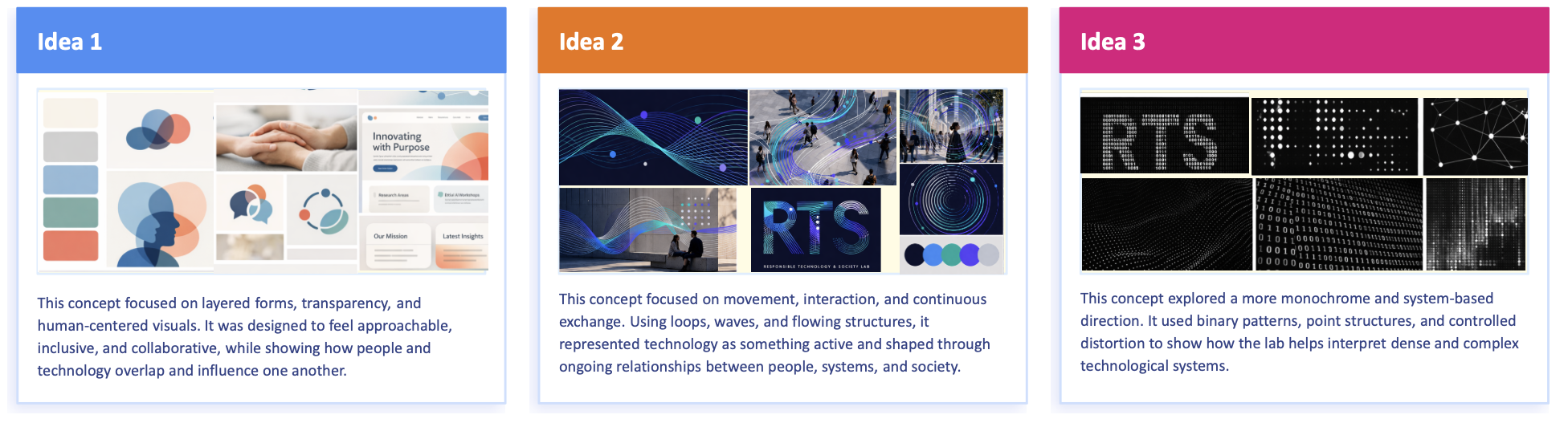
Everyone on the team brought three concepts of their own to critique. Instead of picking one winner, we pulled pieces from three different directions and merged them into Loop Layers, the one that actually shipped.
The Brand System
The custom letterforms repeat that loop motif through overlapping shapes. Fira Sans carries the mark itself, while Montserrat and Source Sans Pro handle everything else. You can flip through the full brand guidelines below.
Designing for Real Users
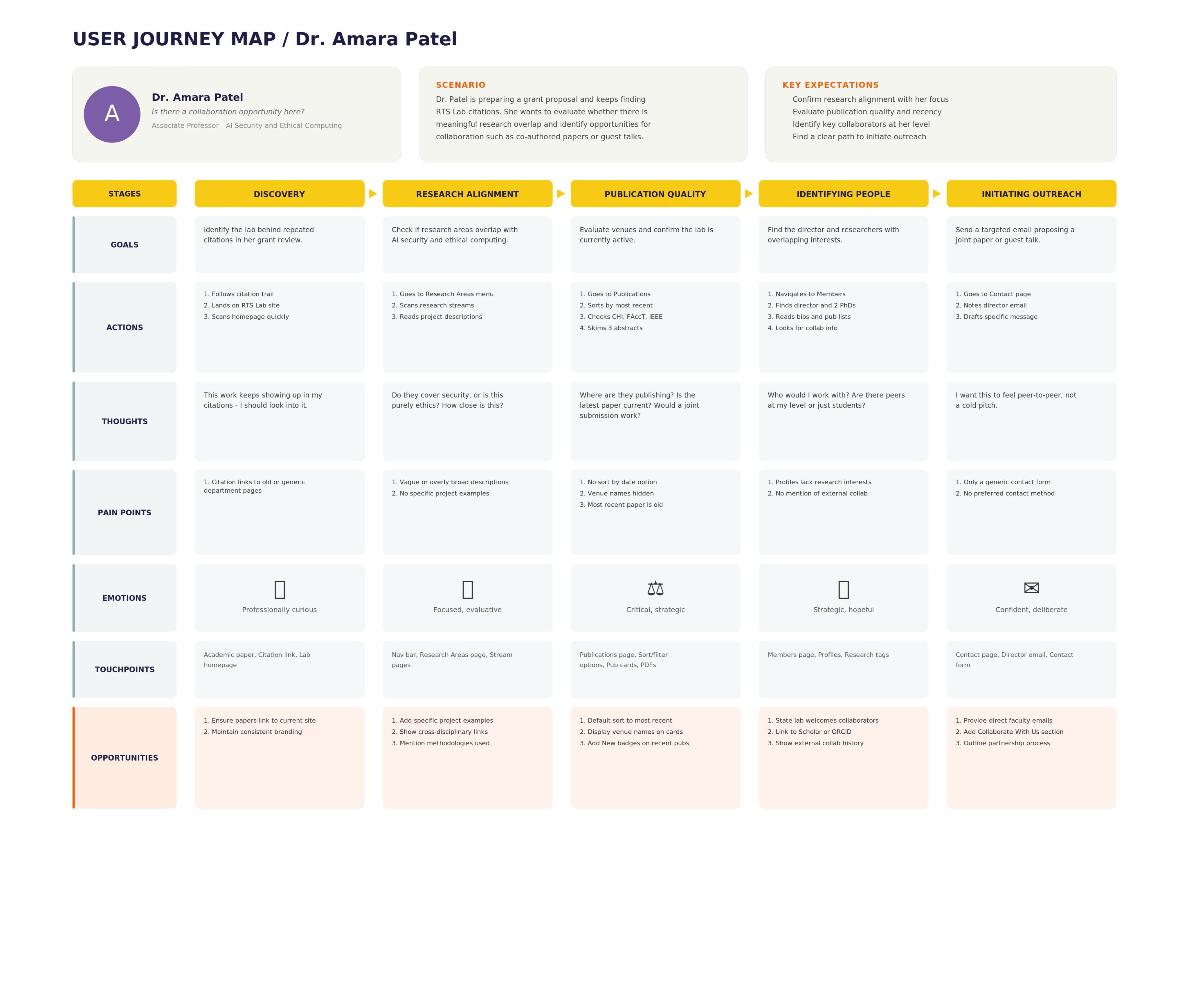
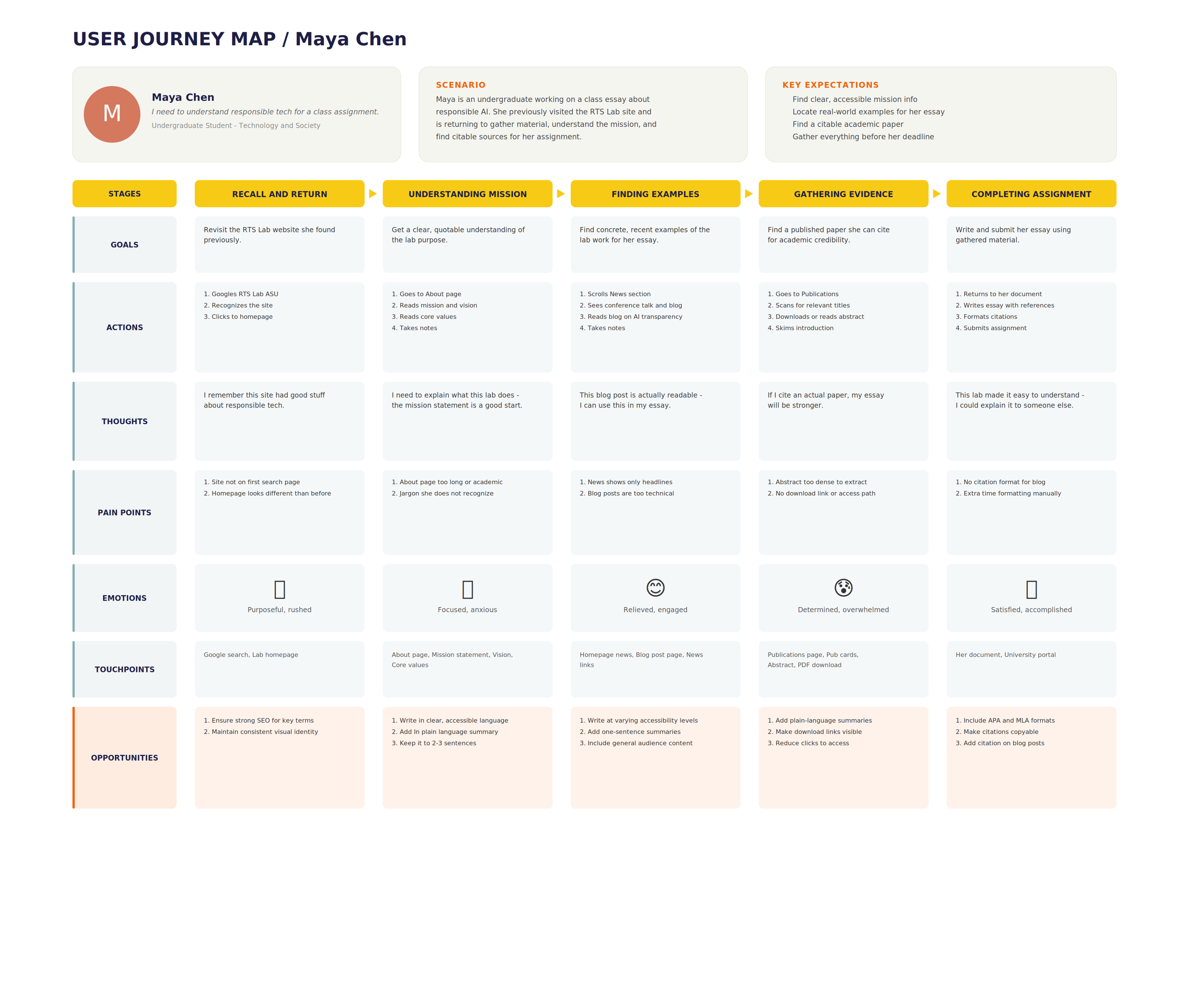
We built out three personas (a PhD researcher, an AI ethics faculty member, and an undergrad CS student) and used what each of them actually needed to shape every navigation and content decision on the site.
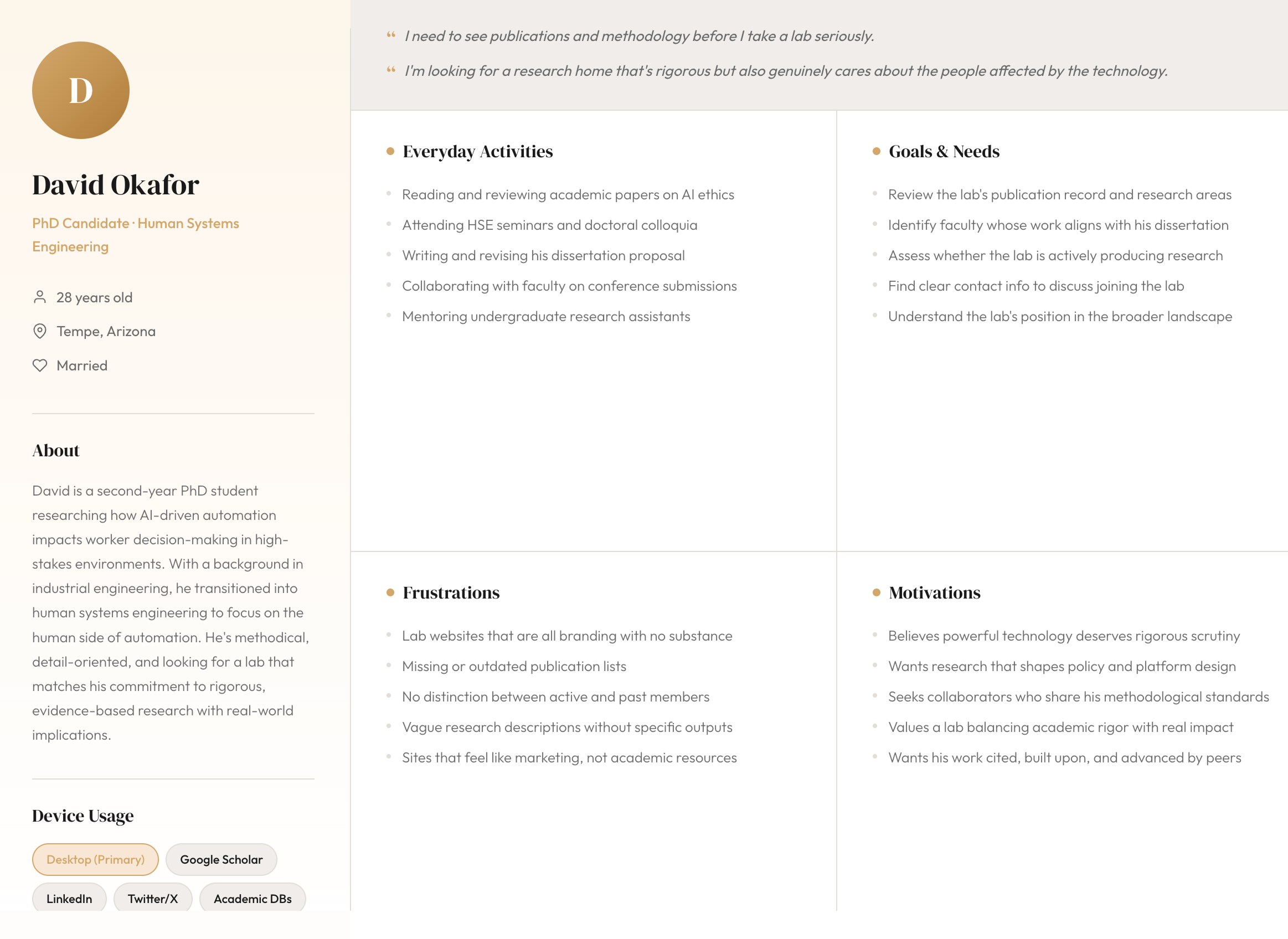
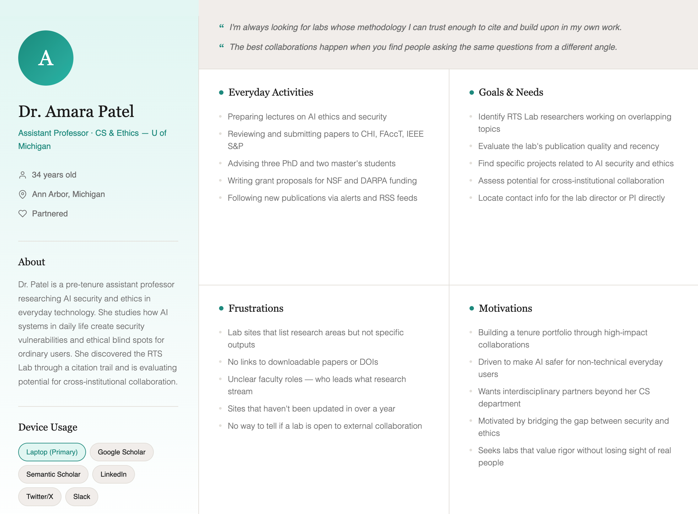
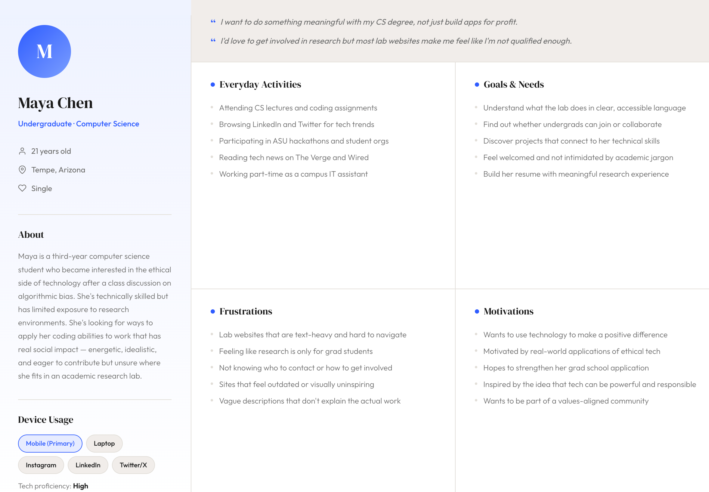
Persona 1 / 3
Structuring the Experience
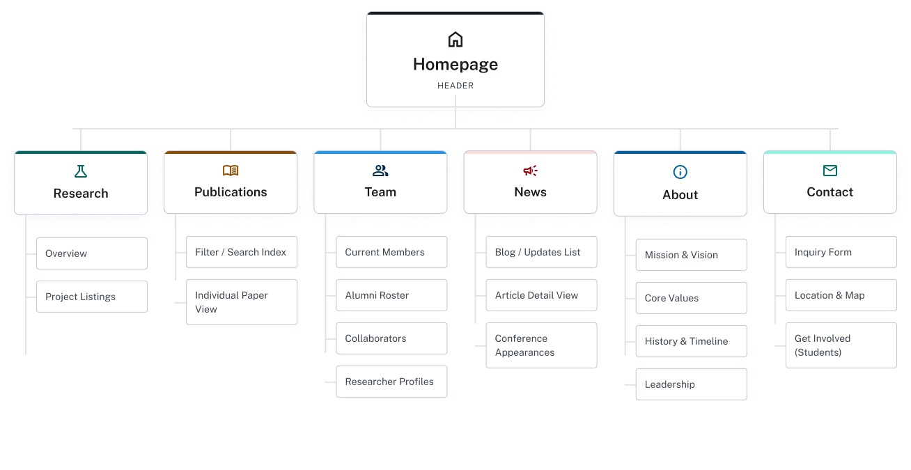
Mapping out how people moved from discovery to research to contact showed us exactly where they got lost, especially around publications and figuring out how to get involved. We used that to build a six-section sitemap based on what people were actually looking for.
User Journey Maps
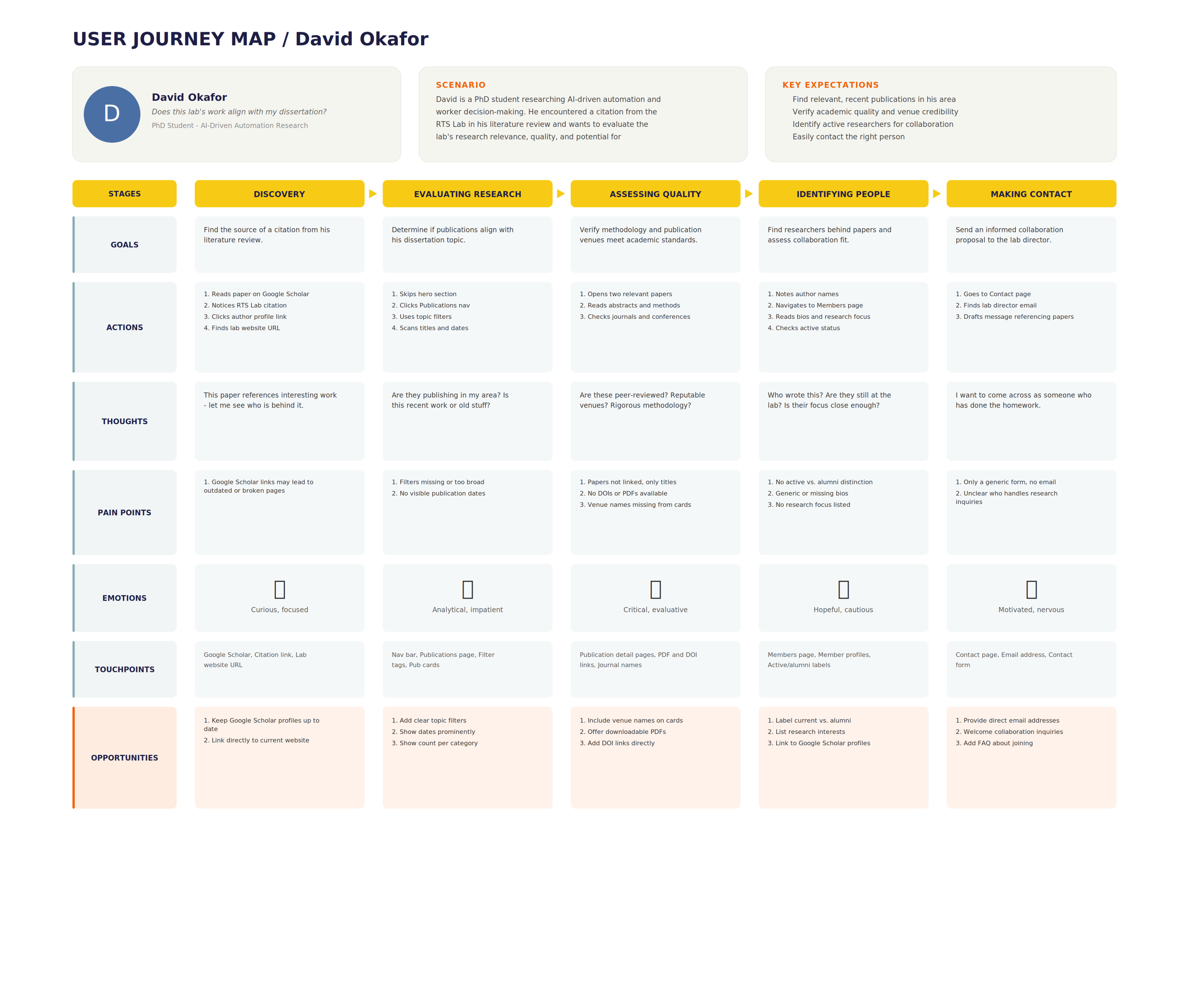
Journey 1 / 3
Web Architecture
What We Delivered
By the end, we handed the lab a full system they could put to use right away: logo files, guidelines, and prototypes, not just concepts in a slide deck.
Brand Identity
Logo system, color, typography, and brand guidelines across print and digital formats.
UX Research
Personas and journey maps grounded in how researchers, faculty, and students actually use the site.
Information Architecture
Sitemap and wireframes for six core sections, shaped by research findings.
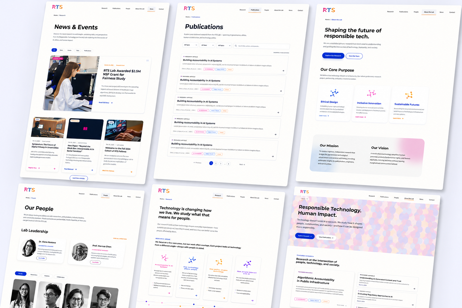
Interactive Prototype
Full desktop and mobile flows in Figma, with the brand applied throughout.
What this project taught me
On this project I wasn't just designing, I was also acting as project manager, so I was juggling both roles at once. That combination taught me how much communication actually matters. With five people pulling from different concepts and different schedules, it was easy for everyone to drift into their own version of the idea. Keeping the team on the same page, through regular check-ins, clear feedback, and just over-communicating decisions, ended up mattering as much as any single design choice.