This brand needed one visual system that worked everywhere, digital, print, and physical, without feeling like five different companies.
Armoni
I built this brand identity solo, from the logo and mascot to environmental graphics, exploring how far visual design can go in creating an emotional connection with people.
I built the whole identity myself: logo, mascot, typography, product applications, a website, and environmental graphics, all speaking the same visual language.
Armoni
Brand & Identity Design
Adobe Illustrator, Adobe Photoshop, Adobe InDesign, Figma, Wix
September 2023 - May 2024
1. Project Overview
Armoni started as a personal exploration of how far visual identity can go in shaping how people feel about a brand. I built out the whole system myself: logo, mascot, product applications, website, and environmental branding for both indoor and outdoor spaces. I wanted it to feel unified wherever you ran into it, memorable, balanced, and easy for anyone to connect with.
I worked on this as a full design study, mostly in Adobe Illustrator, Photoshop, InDesign, and Figma.
2. Concept & Brand Philosophy
The name Armoni comes from the idea of harmony and balance, both visually and conceptually. I wanted color, form, and typography to work together everywhere the brand showed up, without any visual noise getting in the way.
The design direction focuses on:
- Smooth curves inspired by natural movement
- A modern but friendly tone
- A warm, inviting color palette
- Consistent spacing and rhythm across layouts
I wanted the brand voice to feel clear, friendly, and approachable, never corporate or sterile.
3. Logo Design
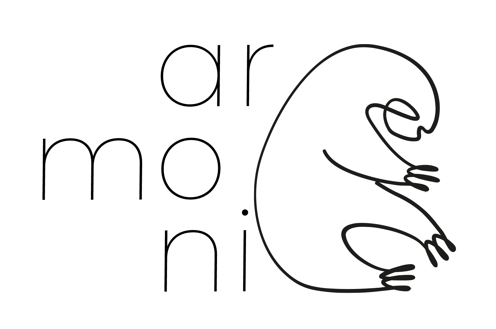
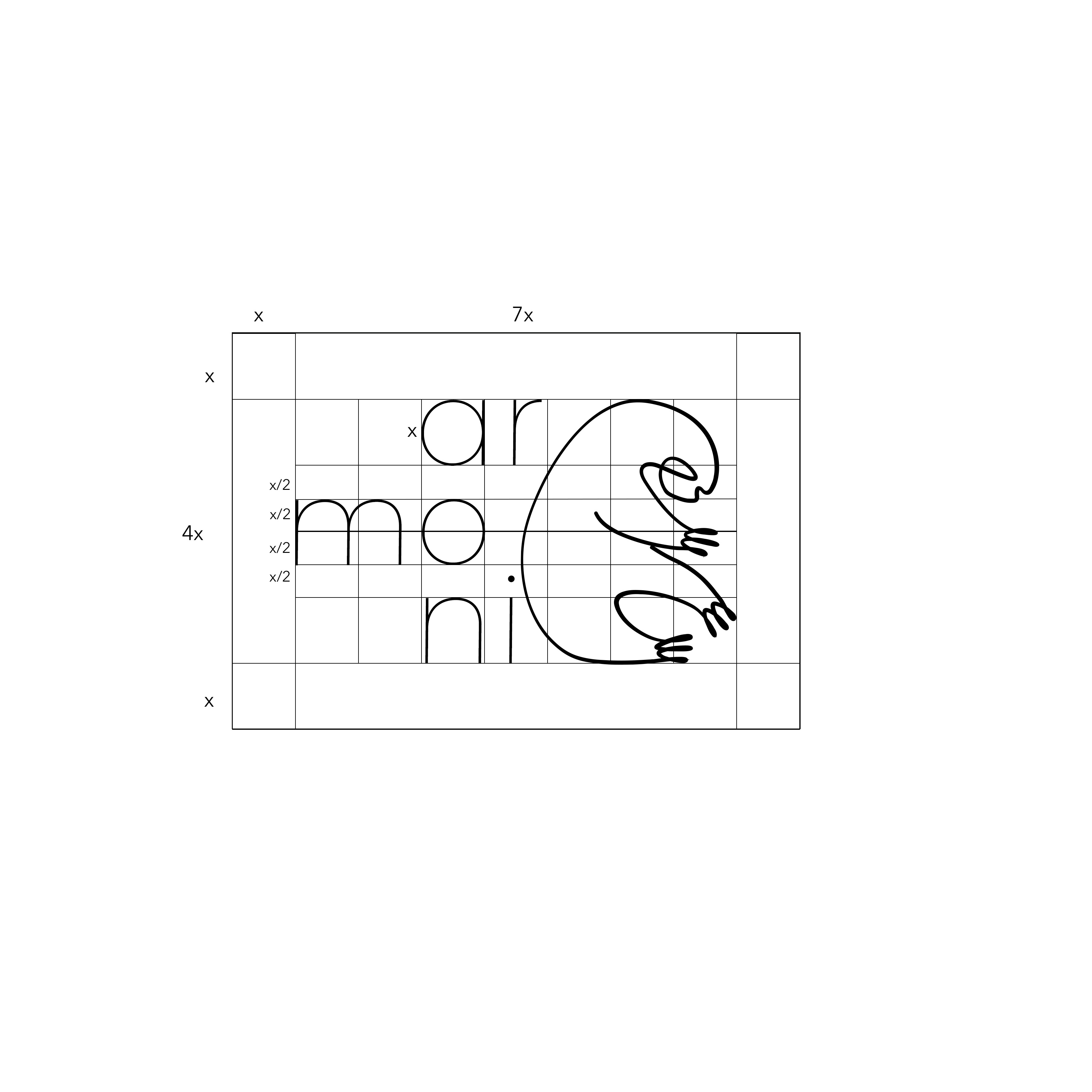
I built the logo out of simple geometric forms to get that sense of balance and movement. The rounded shapes and soft edges give it warmth, while the structured composition keeps it feeling ordered and stable. I designed a few variations, horizontal, stacked, and icon-only, so it would hold up across different applications.
A spacing system and construction grid keep it consistent whether it's scaled up for print or shrunk down for a favicon.
4. Mascot Design
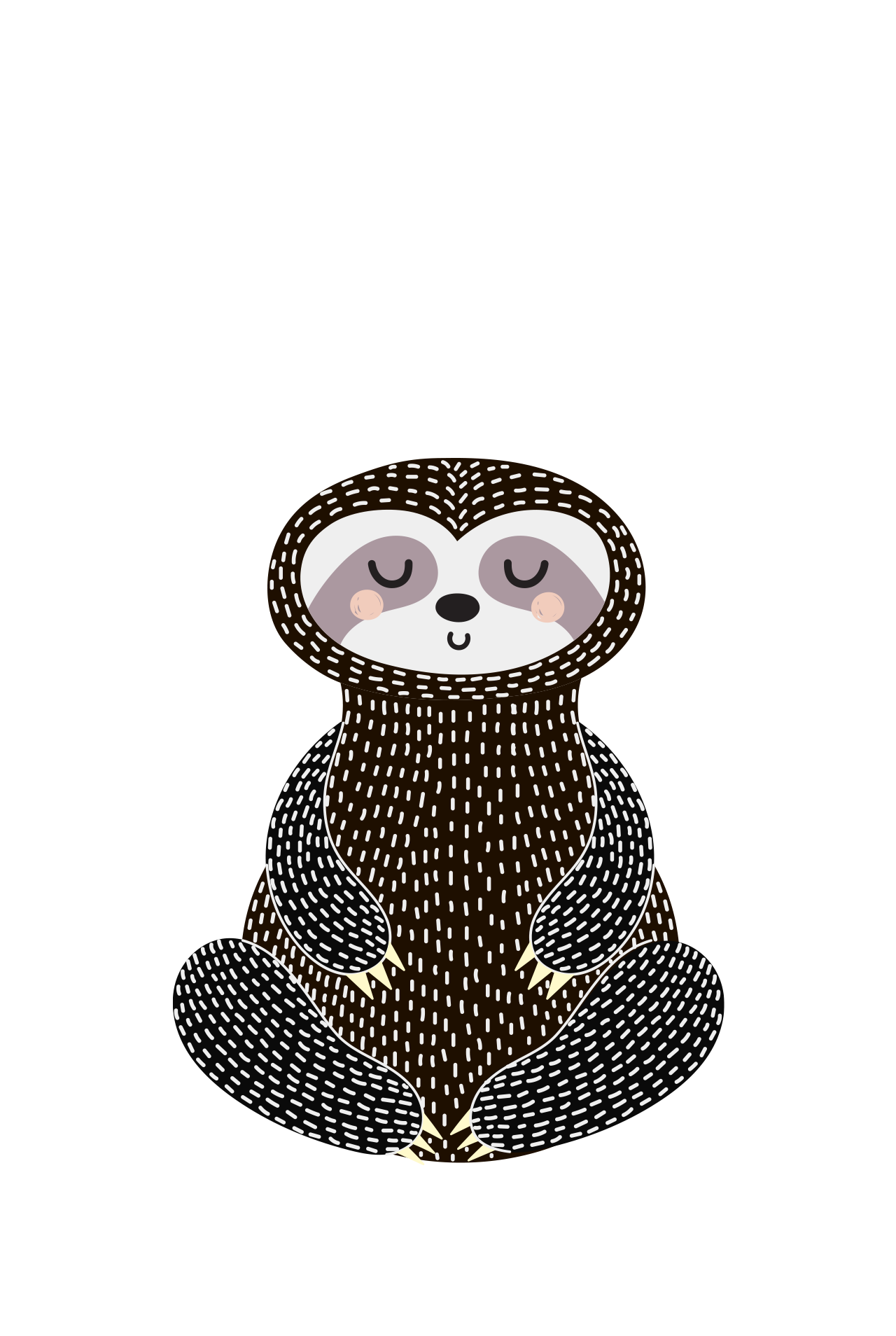
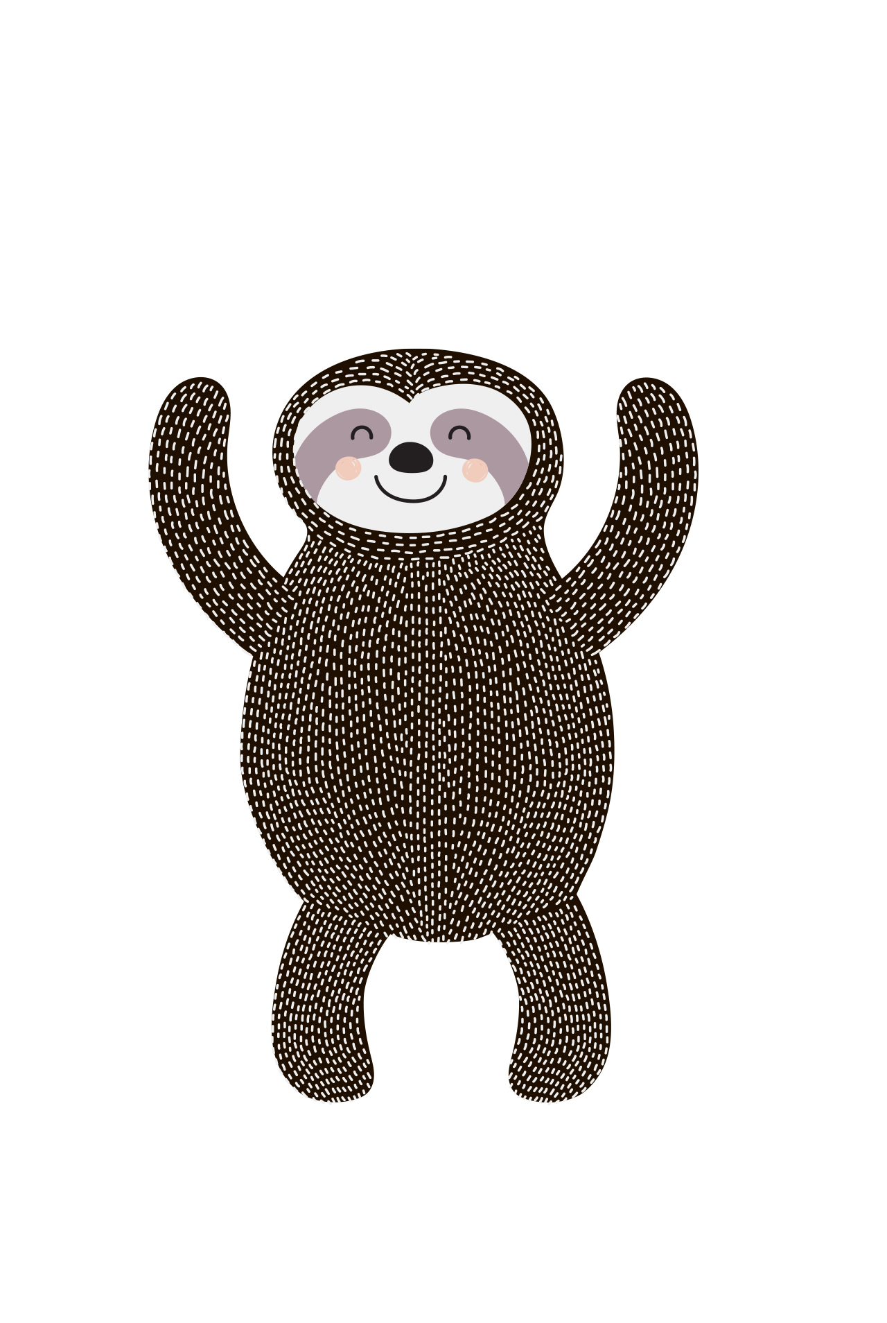
I designed a mascot to give the brand some personality and make it easier for people to connect with. The character echoes the name Armoni through soft shapes, gentle expressions, and a rounded silhouette. It shows up on product packaging, environmental graphics, marketing materials, and promotional content, and it's what makes the brand feel playful instead of just polished.
I thought a few different poses and expressions would give the brand a better feel across different moods, so the mascot could flex across use cases without losing its identity.

5. Color & Typography System
The color palette pairs warm, inviting tones with neutral supporting shades. That combination gives every touchpoint the same rhythm without locking the layouts into one rigid look.
Typography stays functional and clean. Fira Sans carries both body text and headings, while Montserrat comes in as an alternative, mostly in logo applications. I set hierarchy guidelines for print, web, and signage so the type stayed legible no matter the scale.
Branding Manual
6. Stationery & Corporate Collateral
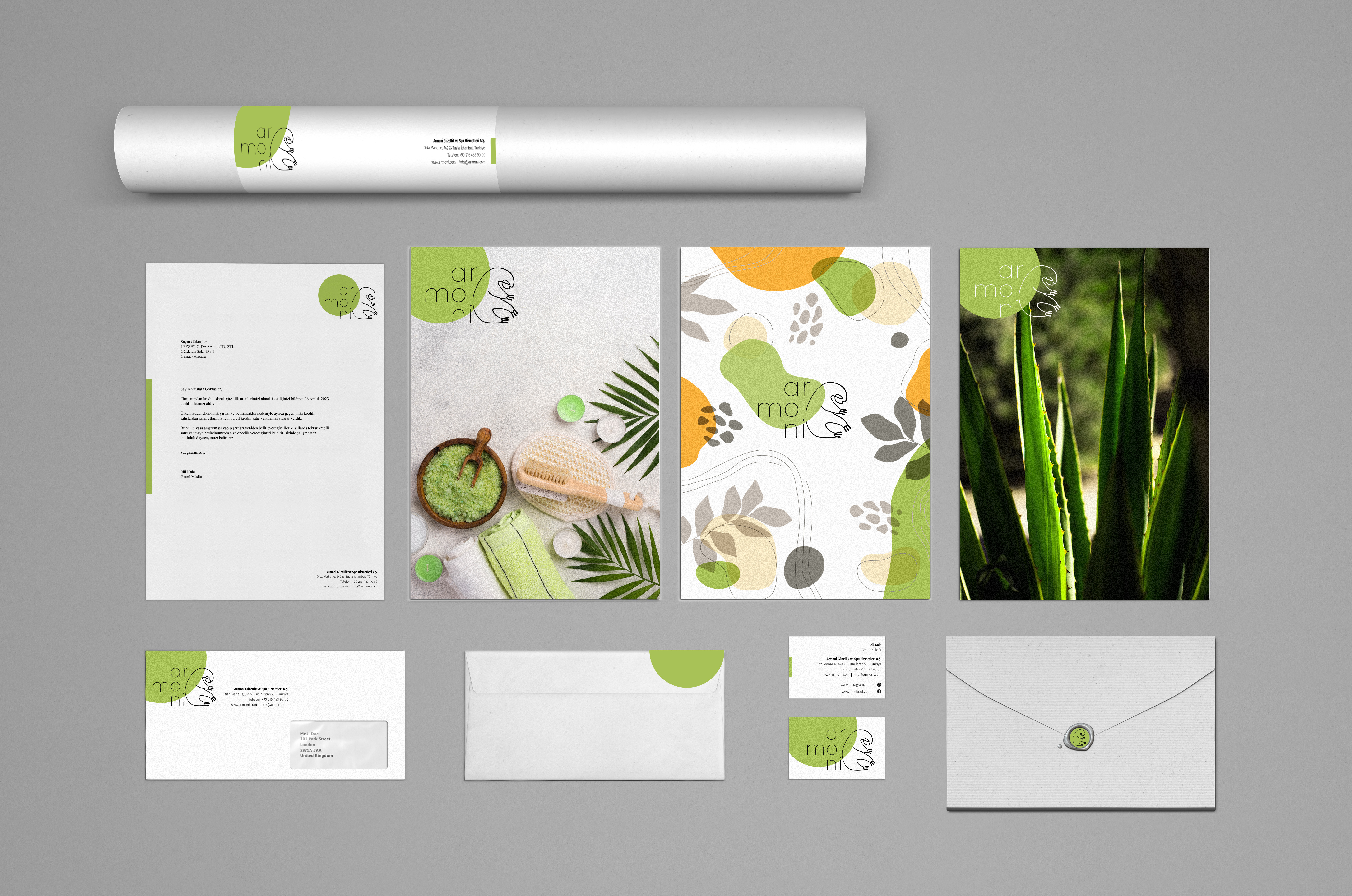
I designed a full stationery package for the brand's more formal, professional side: business cards, envelopes, presentation folders, letterhead, and printed documents. Every piece follows the same spacing, color accents, and mascot placement as the rest of the system.
7. Product Design
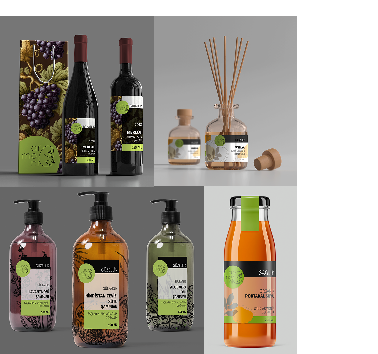
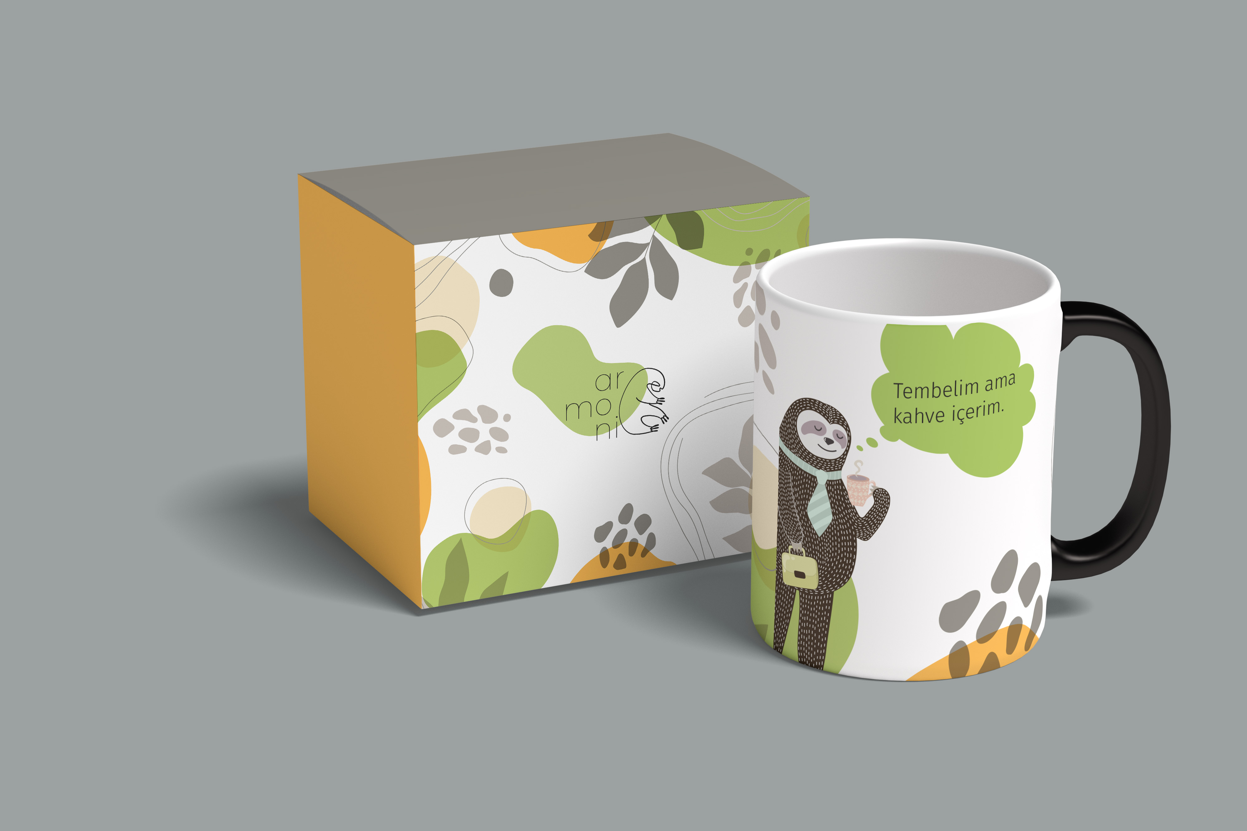
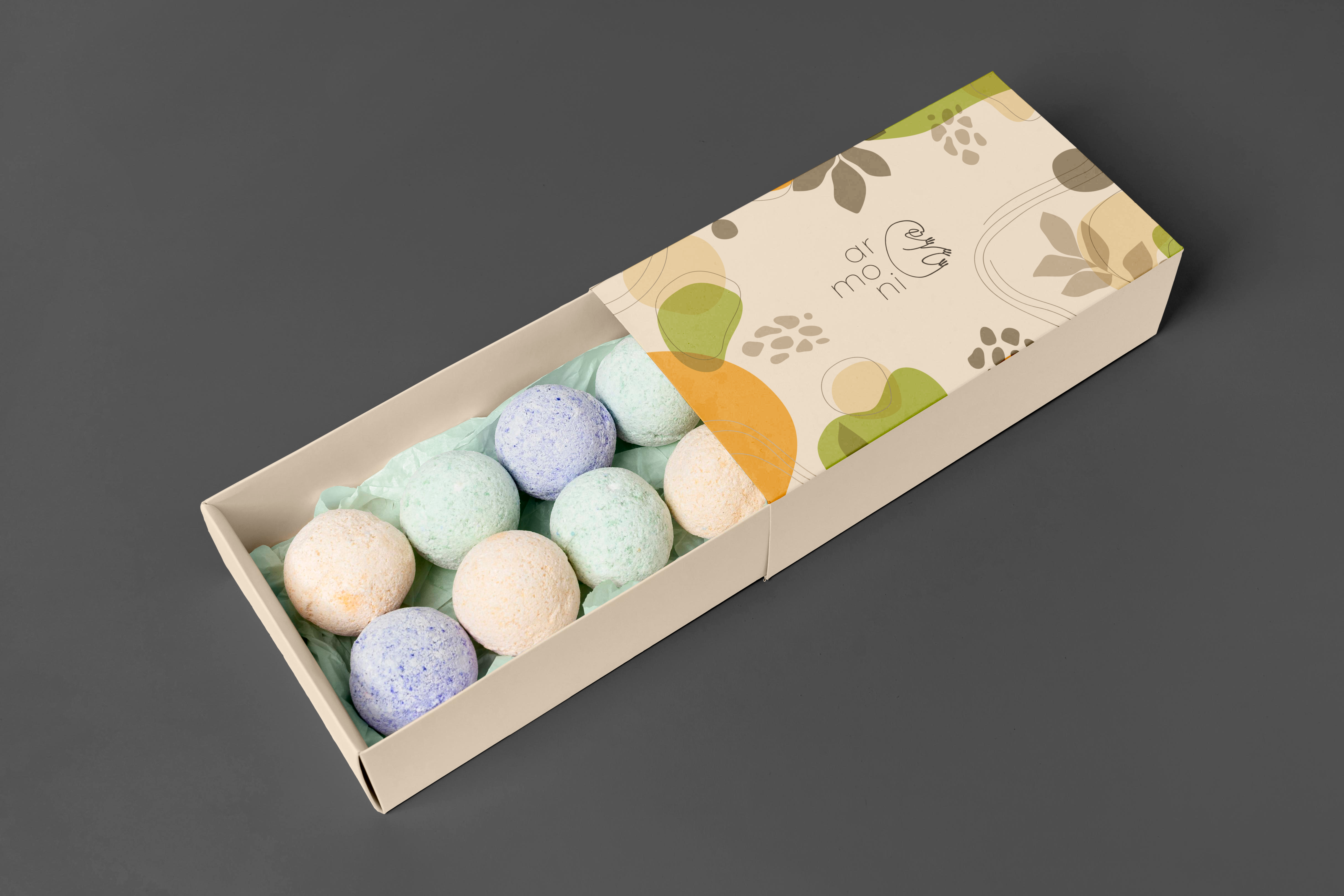
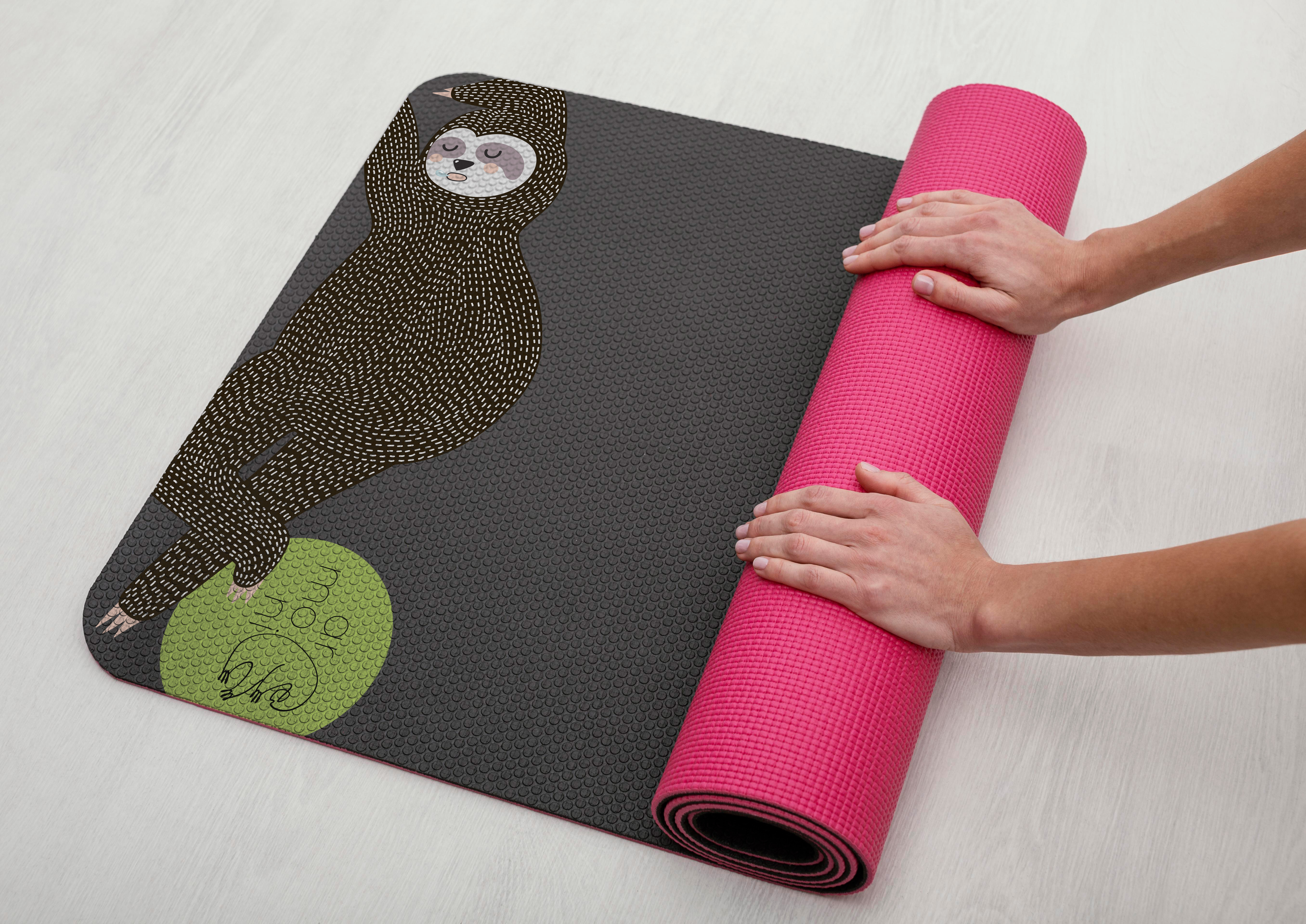
I took the identity further into custom physical products that people could actually use day to day, so the brand wasn't just something you looked at on a screen. Each product works the mascot, color palette, and illustration style into something functional.
Every product sticks to the same guidelines, spacing, rounded forms, soft color transitions, so they all feel like they came from the same place, whether you're looking at the shape, the material, or the graphics on the surface.
It's proof the brand works as something you can hold, not just something you look at.
8. Promotional Items & Branded Merchandise
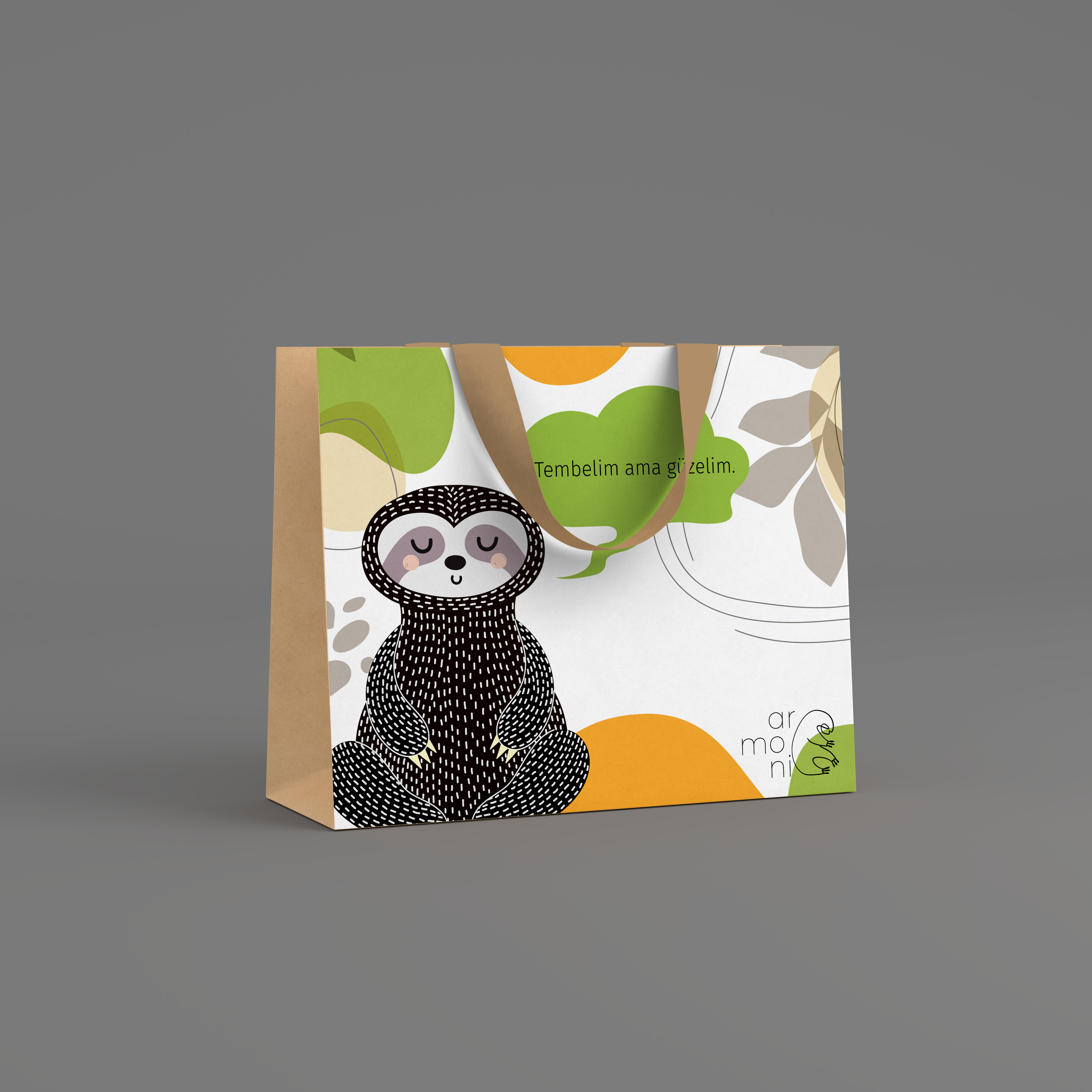
Alongside the core products, I created a set of promotional items to help spread brand awareness, things that could show up at events, pop-ups, and other social settings.
The collection covers apparel, tote bags, stickers, notebooks, accessories, and mascot-themed giveaways. These are less about function and more about visibility, letting the mascot be as playful and expressive as possible.
The idea is simple: give people a low-key, casual way to interact with the brand and remember it.
9. Environmental Branding
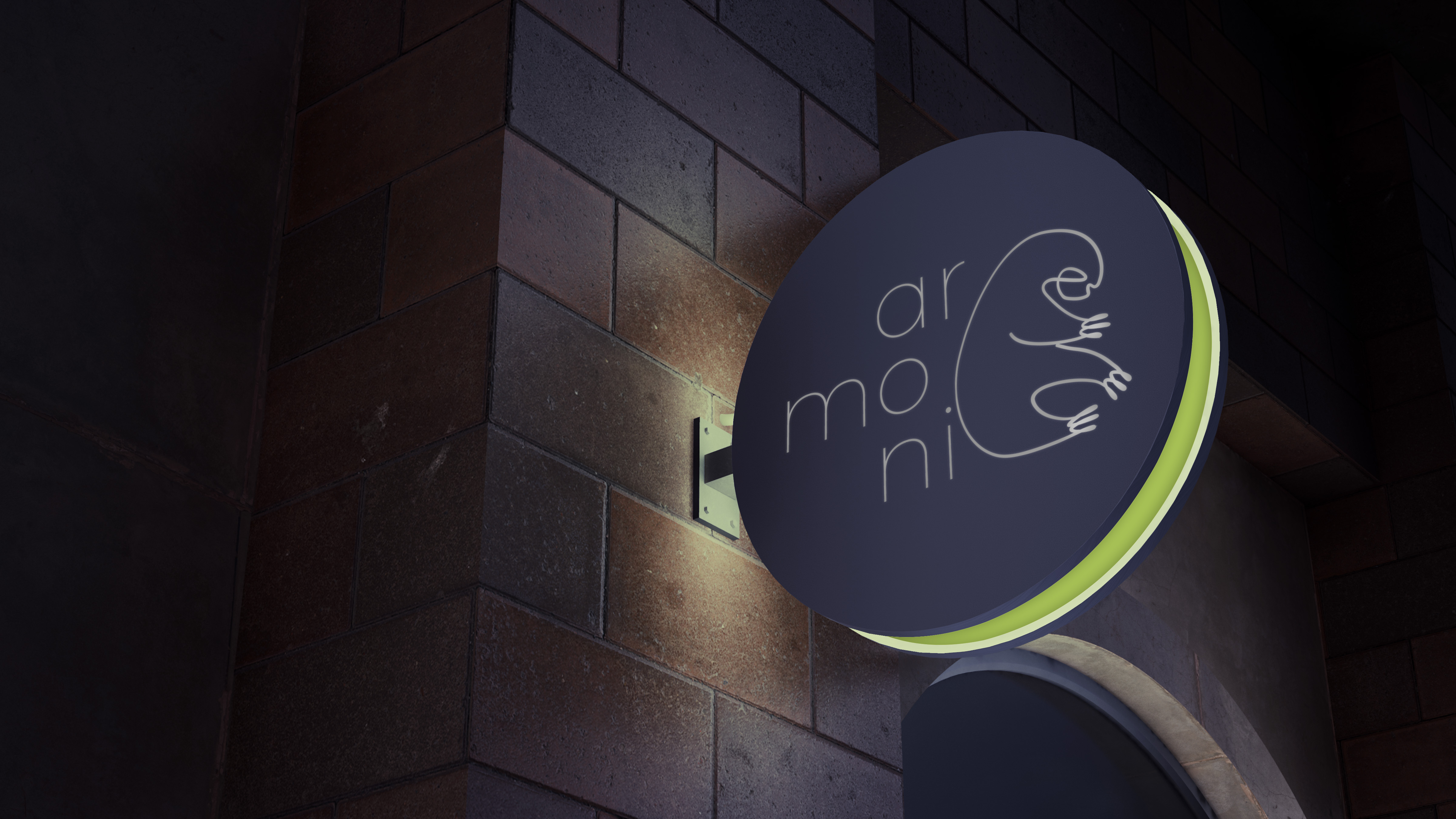
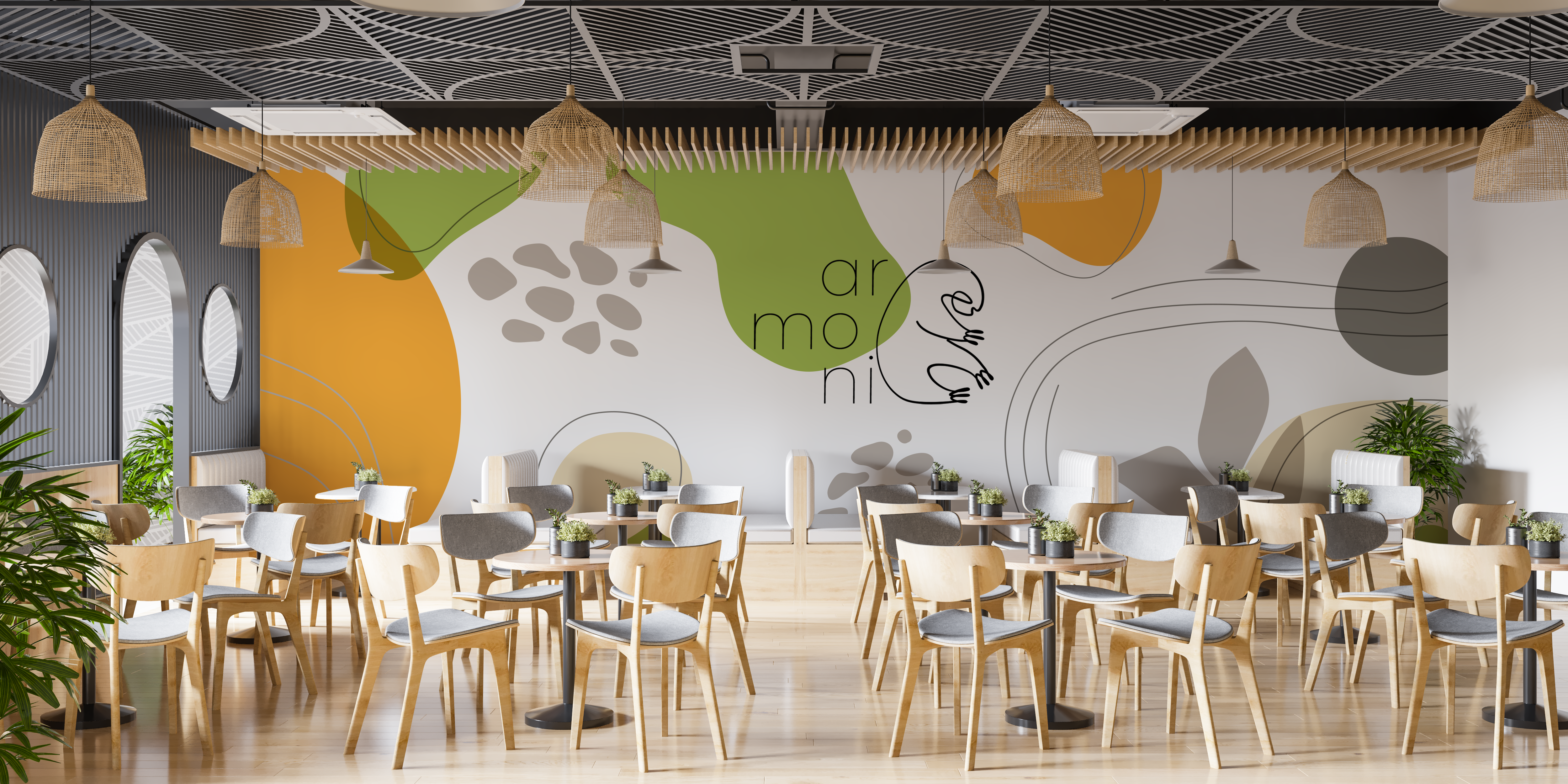
I applied the brand to indoor and outdoor spaces, storefront signage, display walls, interior graphics, and wayfinding. The goal was to make the brand something people could walk through and feel, not just look at.
Outdoor pieces are built to be recognizable from a distance, while the indoor spaces lean into comfort, color, and storytelling up close.
10. Website Design
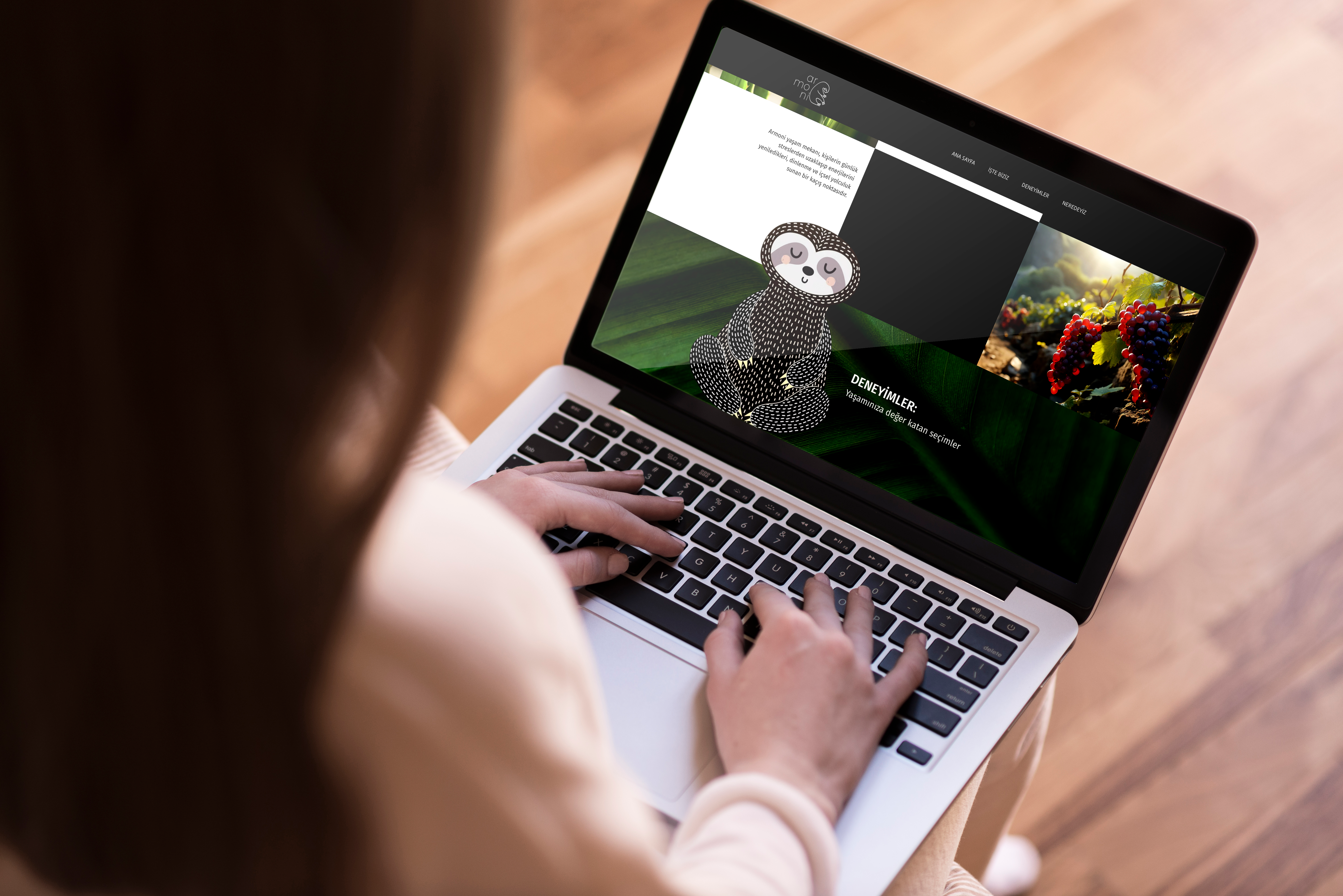
I designed a responsive website to carry the brand's visual language into the digital space. It includes:
- Home page with brand introduction
- Product pages
- Mascot illustrations
- Visual storytelling sections
- Clean navigation and UI structure
The UI leans on large visuals, generous spacing, and soft transitions to match the brand's tone. I prototyped it in Figma with accessibility, legibility, and a mobile-first layout in mind.
11. Brochure Design
I designed a brochure to bring Armoni's identity into a structured print format, prioritizing clarity, clean hierarchy, and balanced layouts through modular grids and consistent type. It leans into the brand's more formal, professional side.
What this project taught me
Building Armoni taught me that consistency across touchpoints matters more than any single hero image. A mascot only works when the spacing, color, and tone stay disciplined everywhere it shows up.